
Duke Collaborative Community Council
Visual Identity, Marketing Collateral
“The Duke Collaborative Community Council (D3C) is a group of community members from Durham and across North Carolina. The D3C works together with the Duke CFAR to help guide HIV research at Duke.”
The D3C's primary mission is to serve and connect with communities of people living with HIV/AIDS through Outreach, Consultation, Membership, Leadership, Community advisory, and Community engagement.
D3C's proximity to their respective communities allows the organization to provide invaluable feedback on HIV/AIDS studies, allowing researchers to understand which topics to approach and how to analyze eventual research results
The Goal
The purpose of this project was to address the D3C's need for a tangible, memorable mark that would lend to assisting the organization's ability to be recognized, apart from the primary Duke University brand, acting as an encouraging communal symbol of optimism for HIV/AIDS research, community outreach, community awareness, and community support.
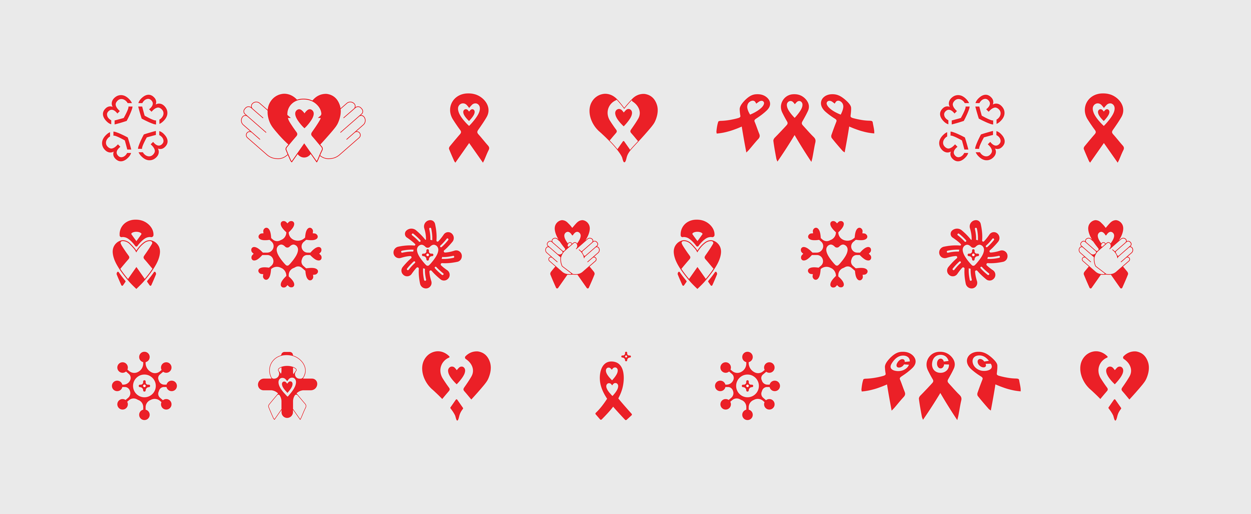
Early Drafts
In the early stage of the design process, I fixated on the idea of an image that combined the red "support and solidarity for those living with HIV' ribbon wrapped around a visual element that felt both communal and reassuring, guiding my decision to incorporate supportive symbols like hearts or helping hands.
The vibes were high when I figured, why not take some time to explore more scientific feelings and organically shaped options akin to badges, pendants, and brooches. Though cliché, I also dabbled with a Plus sign here and there. I felt it imperative that these symbols strike a balance between something that felt caring yet strong, stable, and reliable.
The Solution
After a few meetings with D3C's leaders and excellent feedback from community activists, the design process culminated in our development of the emblem shown below. The final solution expressed a warm feeling that was less clinical but more trustworthy and welcoming, while simultaneously expressing a commanding presence. My favorite feedback from this respective community was that their D3C brand mark felt like the visual of a warm hug.


